


A finished track rarely needs just one image. The same release may appear as square cover art, a vertical story, a wide video thumbnail, a playlist announcement, and a background for a short teaser. Problems start when each asset is designed separately. The colours drift, the subject moves, the lighting changes, and the release begins to look like several unrelated projects rather than one visual identity. Reusing the exact same artwork everywhere creates the opposite problem: the campaign becomes repetitive and every post competes with the same composition.
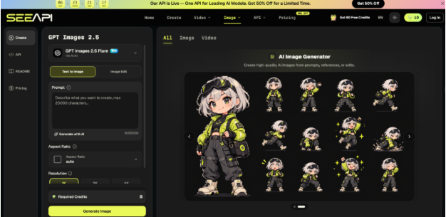
A better approach is to define what must remain recognisable, then create controlled variations around those fixed points. Traditional cropping and layout tools are enough for many formats, but they become limiting when a scene needs more room, a different background, or a revised composition without rebuilding the artwork from scratch. At that stage, an Image 2.5 API workflow can be explored as one option for generating or editing from a written brief and a reference image. The useful skill is not producing more pictures; it is deciding which parts of the visual identity may change and which parts should stay stable.
Define the Release Before Making Variations
Start with a short visual brief that can survive every format. Write down the central subject, the dominant colour relationship, one lighting idea, and the emotional role of the artwork. Avoid filling the brief with broad words such as “cinematic”, “cool”, or “premium” unless you translate them into something visible. “Low-key side lighting with deep blue shadows and one warm light source” is much easier to review than “moody and cinematic”.
Next, separate identity elements from flexible elements. Identity elements are the details that make one asset clearly belong to the same release as another: the same illustrated figure, a distinctive jacket, a red motorbike, a narrow hallway, or a recognisable geometric symbol. Flexible elements can move without breaking recognition: camera distance, empty space, background texture, crop, or the amount of visible environment.
Place two proposed assets side by side and hide the title treatment. If they still connect through subject, palette, lighting, or motif, the visual system is working. If the connection depends entirely on identical text, the artwork needs a stronger shared identity.
Build Variations With Controlled Differences
A useful set of release assets should answer different placement needs rather than produce random alternatives. Decide what each version is for before changing the image.
1. Protect the Recognisable Details
List three to five details that must not drift. For a portrait-based cover, that might be the hairstyle, jacket colour, pose direction, and a specific prop. For an object-led image, it might be silhouette, surface markings, colour, and relative proportions. Put these details in a “keep” note before writing any change request.
This prevents a common mistake: describing only what should be different. If the instruction says “move the scene to a rooftop at night” but never states what must remain stable, the resulting concept may preserve the general mood while changing the very details that connect it to the original release.
2. Change One Visual Variable at a Time
Make the first variation about framing, not framing plus lighting plus wardrobe plus background. A square cover can become a wider composition with more space on one side while keeping the subject and light direction intact. A second variation can test a different environment while holding the pose and palette steady.
Changing one main variable gives you a useful comparison. If the new version feels weaker, you can identify which decision caused the problem. When several things change at once, revision becomes guesswork.
3. Generate or Edit Against the Brief
Use generation when you need a new composition built around the same visual idea; use editing when the current image already works and only a specific part needs to change. For example, a strong square portrait may only need a wider background for a video thumbnail.
When a controlled edit would save rebuilding the whole scene, ChatGPT Images 2.5 API can take a reference image plus written instructions that identify both the requested change and the details to preserve. A useful input might specify the existing subject as the reference, ask for additional space on the right, and retain the pose and clothing while adjusting only the surrounding environment. After generation, compare the result with the source at the size it will actually be published. Check identity details, edge quality, unwanted objects, spacing for text, and whether the new composition still reads as part of the same release.
4. Reject Attractive but Unrelated Results
A visually impressive variation can still fail the campaign. Compare each result against the brief instead of asking whether it looks good in isolation. Reject versions that introduce a new colour story, change a defining object, shift the subject into a conflicting style, or make the focal point unsuitable for the intended crop.
Keep a preferred version as the new working reference only after it passes those checks. That creates a controlled chain of revisions instead of repeatedly starting from whatever image happened to look most interesting.
Match Each Asset to Its Placement
Different placements ask the same artwork to perform different jobs. A square cover needs a strong read at small size. A video thumbnail may need empty space for a title added later. A vertical story may crop the sides, while a wide header often needs the subject off-centre.
Create a placement sheet before exporting. For each format, record aspect ratio, likely crop, text-safe area, and the one detail that must remain visible. Then place the draft into rough frames rather than judging it as a full-screen image. An artwork that feels balanced on a large monitor can become confusing when reduced to a small thumbnail.
Do not force every platform into the same crop. If a square master places a face in the centre, a wide version may benefit from extending the scene instead of cutting the image until it feels cramped.
Review the Set as One Campaign
Individual review catches technical faults; group review catches identity drift. Put the cover, thumbnail, story frame, teaser background, and announcement image on one page. The set should show a clear family resemblance without becoming copies of one layout.
Then run three checks. First, blur your view slightly or reduce the previews until details disappear. Does the palette still connect the set? Second, inspect the defining subject or object. Has its shape, clothing, colour, or position changed enough to feel like a different concept? Third, hide all typography. The images should still belong together without relying on the same title lock-up.
Also check what should not be generated. Artist names, track titles, label details, dates, credits, and other exact text are better added in the design or editing stage where spelling and placement can be controlled. The image can provide space for those elements without being responsible for reproducing them accurately.
Keep the Visual System Easy to Reuse
A consistent release campaign comes from a small set of rules, not from repeating one image. Define the subject, palette, lighting, and motif first. Mark which details are fixed, then vary one major element at a time. Adapt each version to its real placement, and review the complete set at thumbnail size before publishing. When a result looks attractive but breaks the shared identity, discard it rather than forcing it into the campaign.
Save the brief together with the approved master image, placement notes, and rejected directions. That record becomes useful when a new format appears a week later or when another person has to prepare the next asset. Instead of trying to remember why the original artwork worked, they can see the decisions that were meant to survive. Over time, this turns visual consistency from a matter of taste into a repeatable production method: preserve the signals that identify the release, change only what the placement requires, and judge every variation against the same reference point.

