


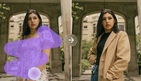
A memorable music release is shaped by more than its melody, rhythm, or production quality. The visual presentation surrounding a track can influence how listeners interpret its mood, recognize its creator, and remember it after the music ends. For independent musicians working without a dedicated design team, an ai image generator can provide a practical starting point for exploring album artwork, promotional graphics, and visual concepts that reflect the character of their sound. The real challenge is developing imagery that feels connected to the music rather than choosing a design simply because it looks impressive.
The Connection Between Sound and Visual Expression
Musicians regularly make creative decisions about tempo, instrumentation, arrangement, and atmosphere. Similar decisions can guide the visual presentation of a release. A delicate acoustic composition may suit natural textures and understated colors, while an energetic electronic track could call for sharper shapes, dramatic lighting, or a more experimental aesthetic.
These relationships are subjective, which makes experimentation valuable. There is no universal visual formula for a particular genre, and artists should avoid assuming that every song needs the same familiar imagery. A more effective approach begins with the emotional experience the music is intended to create.
Consider an instrumental track built around piano, soft percussion, and a gradually developing melody. Its artwork might feature an empty room illuminated by afternoon sunlight, creating a sense of space and reflection. A faster composition with layered synthesizers might inspire an abstract arrangement of contrasting colors and geometric forms.
Both concepts communicate a mood without attempting to illustrate every musical element literally. This gives the artwork a clear purpose while leaving listeners room to interpret the music for themselves.
Why Album Artwork Needs a Clear Creative Direction
Album artwork often appears in small thumbnails, streaming libraries, playlists, and promotional posts. In these settings, viewers may have only a moment to recognize the artist or understand the visual character of a release.
A strong design therefore needs a clear focal point. Too many objects, competing colors, or decorative effects can make the composition difficult to understand, particularly when displayed at a reduced size.
Before creating artwork, musicians should establish three basic elements: the mood of the release, its central visual idea, and the audience it is intended to reach. These decisions help determine whether the design should feel minimal, cinematic, playful, nostalgic, or unconventional.
Typography also deserves careful consideration. Artist names and track titles should remain legible without dominating the composition. Because generated imagery may contain distorted letters, adding text separately in a design application can offer greater control over spacing, alignment, and readability.
The final design should also work across different formats. A square cover may need to become a vertical social media graphic or a horizontal website banner. Planning for these adaptations early can reduce unnecessary redesign work later.
Turning a Creative Brief Into a Visual Concept
One of the most useful ways to approach music artwork is to write a short creative brief before selecting an image. This does not need to be complicated. A few sentences describing the track’s atmosphere, intended audience, and central idea can provide a clear foundation.
For example, an artist preparing a reflective instrumental release might describe the music as intimate, spacious, and slightly nostalgic. The visual brief could then suggest a quiet city street after rainfall, muted blue tones, and a single warm light in the distance.
This process helps translate abstract feelings into visual choices. It also makes it easier to compare different concepts without losing sight
When exploring an ai image generation workflow, musicians benefit from evaluating images against consistent criteria instead of choosing the first attractive result. The goal is to identify the concept that best represents the music, not necessarily the image with the greatest visual complexity.
of the original intention.
A useful brief should identify the main subject, the setting, the desired lighting, and the overall artistic treatment. It can also specify what the image should avoid, such as excessive decoration or an overly dramatic atmosphere.
Rather than developing dozens of unrelated ideas, musicians can explore a few distinct directions. One might use photography-inspired imagery, another could rely on abstract forms, and a third might emphasize symbolic objects. Comparing these approaches reveals which visual language best supports the release.
Using AI Tools Without Losing Artistic Control
AI-assisted visual creation can help independent artists explore ideas before investing in detailed production. Dreamina is one option musicians can explore when developing visual concepts from written descriptions and experimenting with different artistic directions.
The most useful approach is to treat generated results as creative drafts rather than automatically finished artwork. A first image may establish an interesting composition but still require adjustments to its colors, framing, details, or overall balance.
Artists should also remember that technical convenience does not replace creative judgment. An image may be polished and attractive while communicating a completely different mood from the intended track. Reviewing each result against the original brief helps maintain a meaningful connection between sound and design.
For more reliable results, change one or two instructions at a time. If a composition feels crowded, simplify the description. If the atmosphere seems too bright for a reflective song, adjust the lighting and palette. Focused revisions make it easier to understand why a particular result works.
Comparing Visual Concepts Before Choosing a Final Design
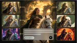
When exploring an ai image generation workflow, musicians benefit from evaluating images against consistent criteria instead of choosing the first attractive result. The goal is to identify the concept that best represents the music, not necessarily the image with the greatest visual complexity.

Start by checking emotional relevance. Does the image communicate the mood of the track, or does it introduce an unrelated atmosphere? Next, consider recognition: is there a clear focal point that remains visible when the artwork is displayed as a small thumbnail?
Originality matters as well. Common visual conventions can be useful starting points, but relying too heavily on familiar imagery may make a release difficult to distinguish from similar projects. A specific location, unusual composition, meaningful symbol, or distinctive color combination can give the artwork a stronger identity.
Finally, consider practical requirements. The selected image may need space for typography, cropping for different platforms, or additional editing before publication. Choosing a concept that accommodates these needs can save time during the finishing stage.
Maintaining Consistency Across Multiple Releases
An artist’s visual identity becomes more recognizable when separate releases share a few deliberate design characteristics. These might include a recurring color palette, a particular typographic style, a preference for spacious compositions, or a consistent approach to lighting.
Consistency does not require identical covers. A musician can release music with different moods while preserving a recognizable creative signature. For example, one cover might feature a landscape and another an abstract composition, yet both could use similar typography and restrained color treatment.
A simple visual guide can help maintain this continuity. It might document preferred colors, font choices, image treatments, logo placement, and guidelines for promotional graphics.
This is particularly useful when several people contribute to an artist’s online presence. A shared reference reduces the likelihood that every new release will look as though it belongs to a different project.
Common Mistakes That Weaken Music Artwork
One frequent mistake is choosing an image solely because it follows a current design trend. Trends can provide inspiration, but they may not reflect the artist’s sound or long-term identity.
Another problem is excessive detail. A complicated image can lose its impact when reduced to thumbnail size, while unnecessary text can compete with the main visual idea. Simplicity often improves recognition when every element has a clear purpose.
Artists should also avoid presenting generated imagery as a literal representation of a real person, product, venue, or event when important details have been invented. The artwork should not mislead listeners about what the release represents.
Rights and licensing deserve attention before publication, too. Publicly accessible images are not automatically available for commercial reuse, and platform terms may impose conditions on generated content. Musicians should review the applicable requirements and ensure they have permission to use any source assets included in the final design.
Preparing Artwork for Release Day
Once the creative direction has been selected, the finishing process should focus on accuracy and consistency. Check the image dimensions against the intended platform’s requirements, review the final crop, and ensure that the artist name and track title are spelled correctly.
View the artwork at several sizes. Details that appear clear on a large screen may become difficult to recognize in a playlist or mobile interface. If the composition loses its focus when reduced, simplify the design or adjust the placement of key elements.
It is also useful to prepare related promotional assets in advance. A consistent set of graphics for social posts, artist profiles, and release announcements can make a campaign feel coordinated without requiring every asset to repeat the same image.
The final review should include a check of licensing, visual accuracy, and file quality. These practical steps help prevent avoidable problems once the music becomes publicly available.
Making Visual Design Part of the Creative Process
Visual identity is most effective when it develops alongside the music rather than being treated as an unrelated promotional task. By defining the emotional character of a release, exploring distinct visual concepts, and refining the strongest direction, independent musicians can create artwork that supports their sound and helps audiences recognize their work.
AI-assisted tools can make early experimentation more accessible, but the artist’s decisions remain central. The choice of imagery, composition, color, and typography should reflect a clear creative intention.
Ultimately, successful artwork does not need to be complicated or expensive. It needs to communicate the right feeling, remain recognizable across platforms, and establish a meaningful connection between the music and the person who created it.